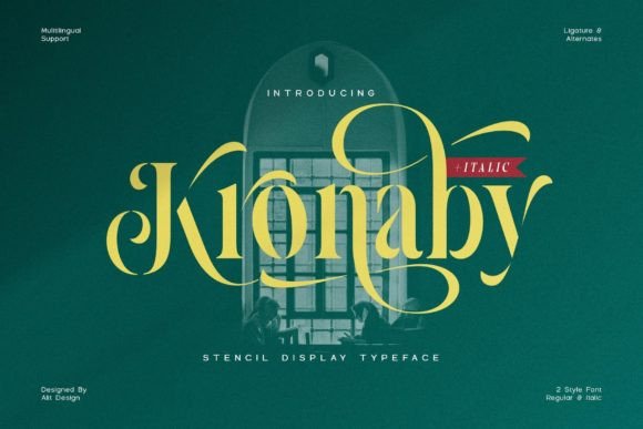
Kronaby: A Serif Font That Elevates Campaign Headlines
It was 3 p.m. on a Tuesday—two days before the launch of a new online course series—and I was tweaking the Instagram carousel for the teaser campaign. The first slide needed to stop scrollers mid-feed: bold, confident, but not aggressive. I’d already cycled through three sans serifs and two classic serifs that felt either too stiff or too quiet. Then I dropped in Kronaby. Instantly, the headline “Foundations First” gained presence—not just size, but personality. Not military stencil, not vintage diner sign, but something sharper, more intentional: a serif font with breathing room, subtle swash, and just enough structure to feel trustworthy.
A Stencil With Substance—Not Just Style
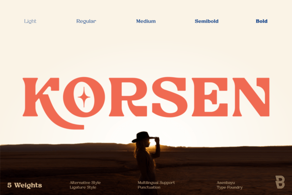
Kronaby is a display serif font that rethinks what stencil typography can communicate. Yes, it uses cut-out letterforms—but instead of shouting “tactical” or “industrial,” it leans into elegance and rhythm. The vertical stress is strong, the serifs are crisp but softened at the terminals, and the slight swash on characters like g, y, and f adds movement without sacrificing legibility. It’s not decorative for decoration’s sake; it’s designed to anchor a message while inviting a second look.
In practice, that means Kronaby performs best where you need instant recognition and tonal clarity: YouTube thumbnails (especially against high-contrast backgrounds), Pinterest pins with layered text overlays, Reels covers with minimal copy, and email banner headers where space is tight but impact is non-negotiable. I used it for a webinar banner announcing “Design Systems Decoded”—paired with a muted teal background and light gray body text—and the title didn’t compete with the imagery. It sat *with* it, elevated but never overwhelming.
Where Kronaby Shines (and Where It Steps Back)
Kronaby is a headline-first serif font. It thrives in short-form, high-visibility contexts:
- Instagram post titles — especially for quote graphics or content series headers (e.g., “Week 3: Typography as Strategy”)
- Digital ad headlines — tested well in Facebook and Google Display ads where the copy is under six words and appears above product visuals
- Online shop promotions — “Early Access Live Now” worked cleanly over lifestyle product photos, even at 24px on mobile previews
- Landing page H1s — particularly when paired with ample whitespace and a clean supporting font
- Branded template packs — designers appreciate its distinct voice without requiring heavy customization
That said, Kronaby isn’t built for paragraphs, captions, or dense UI labels. At under 16px—or on low-resolution mobile previews—the stencil breaks can blur slightly, softening contrast. It also doesn’t carry formal corporate tone well: avoid it for investor decks, legal disclaimers, or B2B SaaS feature lists where neutrality and precision outweigh character. Think of it as your campaign’s signature voice, not its full vocabulary.
Pairing It Right—Typography as Teamwork
Kronaby gains strength through contrast. Its most effective pairings follow one rule: let the serif lead, and let the supporting font recede with clarity. A clean, neutral sans serif—like Inter, Poppins, or even system fonts (San Francisco, Segoe UI)—works beautifully for body text, subheads, and CTAs. The difference in texture creates instant hierarchy without visual noise.
I’ve also seen success pairing Kronaby with a restrained script font (think a light-weight, low-contrast option like Playfair Display Italic or Sorts Mill Goudy) for pull quotes or limited accent phrases—but only when the script is used sparingly and sized thoughtfully. Avoid stacking multiple decorative fonts; Kronaby’s swash already carries expressive weight.
For web use, check whether the Kronaby package includes OpenType features like ligatures or stylistic alternates. In one client campaign, enabling the alternate Q and R glyphs gave the logo lockup a subtle custom feel—no extra design time, just smart font usage.
Practical Checks Before You Drop It Into a Campaign
Before finalizing Kronaby in any live asset, run through these quick checks:
- File formats: Confirm you have WOFF2 for web, OTF/TTF for design apps, and EOT if supporting legacy email clients
- Weights & styles: Kronaby includes Regular, Bold, and often an Italic—verify which are licensed for commercial use, especially in digital ads or client-facing templates
- Licensing scope: Some versions allow unlimited web use; others restrict ad platforms or merchandise. If you’re building reusable branded templates, confirm redistribution rights
- Language support: Test accented characters (é, ñ, ü) in your campaign copy—Kronaby handles Western European languages well, but double-check Cyrillic or diacritic-heavy phrases if relevant
- Mobile preview test: Zoom to 50% in Figma or Photoshop—does the stencil remain distinct? Does the swash still read as intentional, not broken?
One last note: Kronaby works especially well on light backgrounds with dark text, but don’t shy away from dark mode. On charcoal or deep navy, use white or off-white text with a subtle drop shadow (1px, 75% opacity) to preserve edge definition—no heavy outlines needed.
At its core, Kronaby isn’t about trend-chasing. It’s about choosing a serif font that brings intentionality to your campaign’s first impression—where every letter feels considered, not just placed. It’s the kind of typeface that makes your audience pause, not because it’s loud, but because it’s quietly sure of itself. And in a feed full of sameness, that kind of confidence is rare—and useful.